- Company: Panco (Formerly Pantel)
- Role: UX Lead
- Duration: June 2020 - December 2020
- Tools: Excel Spreadsheet, Balsamiq, Sketch, Optimalworkshop
Practice building, Leadership, Research-driven strategy
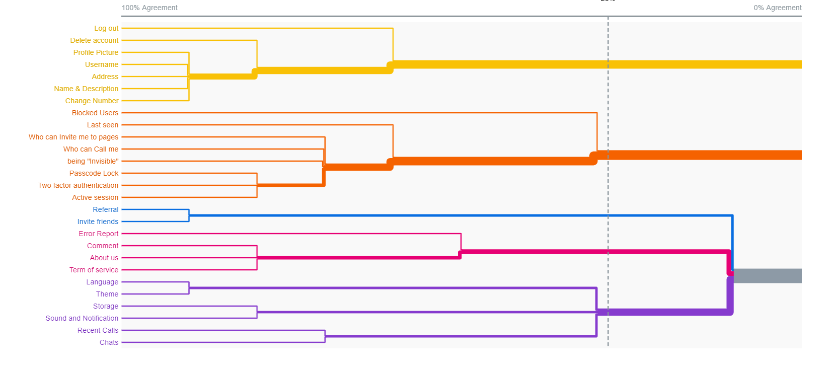
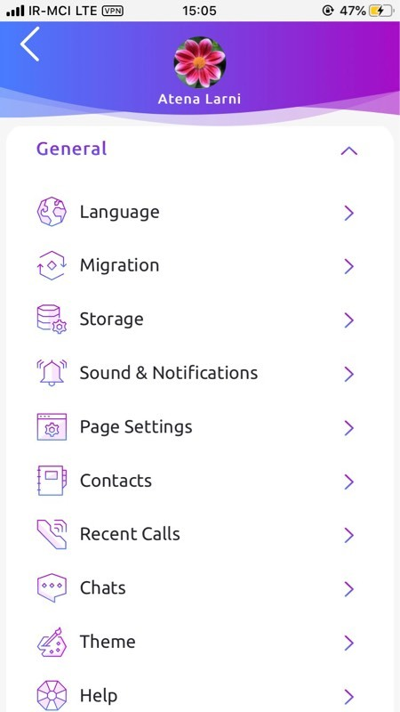
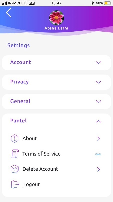
Result of the card sorting for improving information architecture of the app

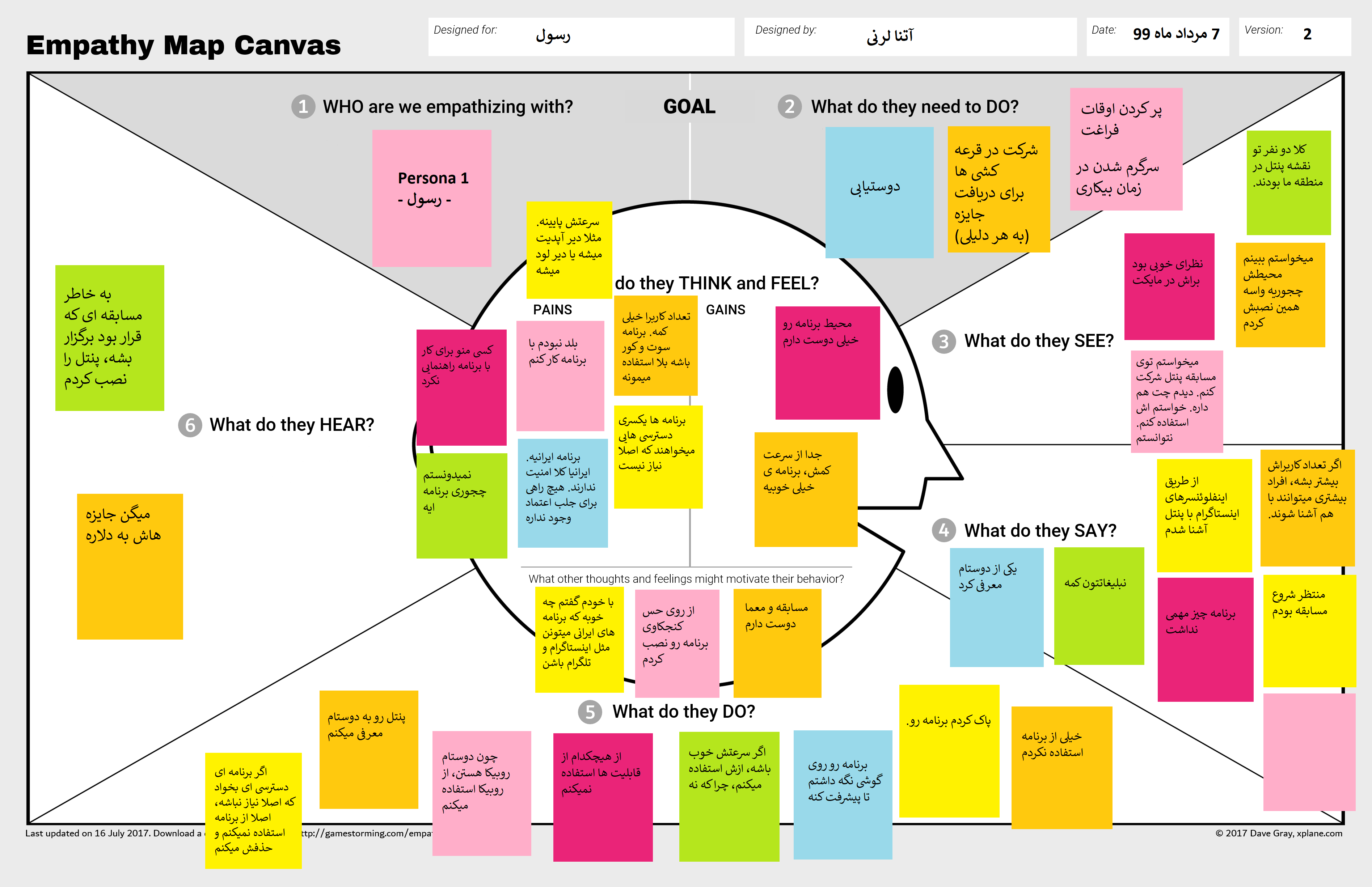
Empathy map based on research findings
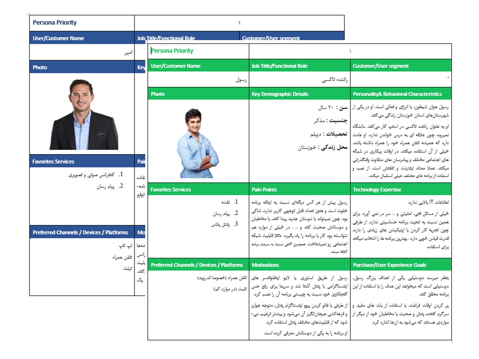
Two primary Personas based on research findings
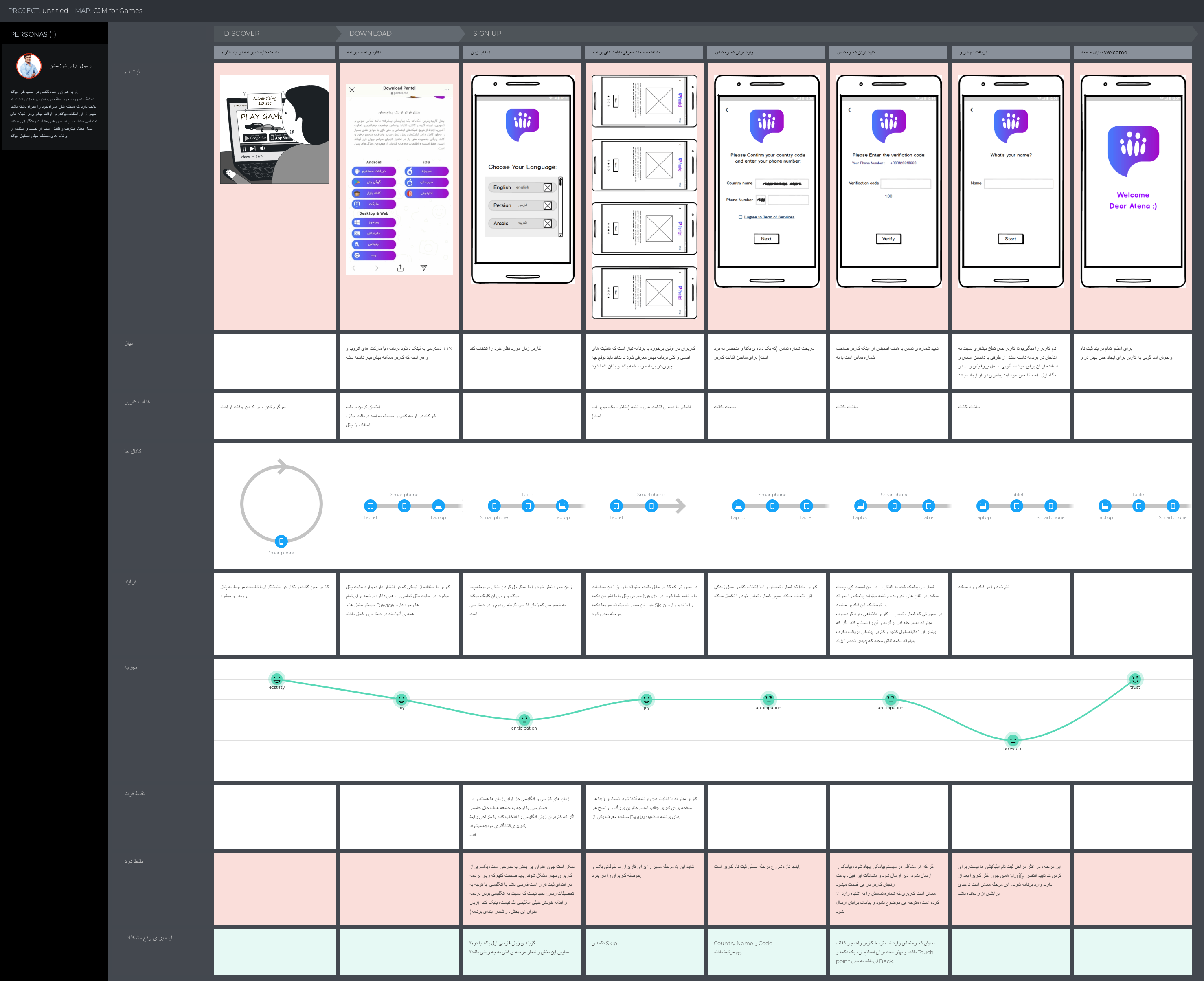
Mapping Customer journey to identify pain points
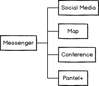
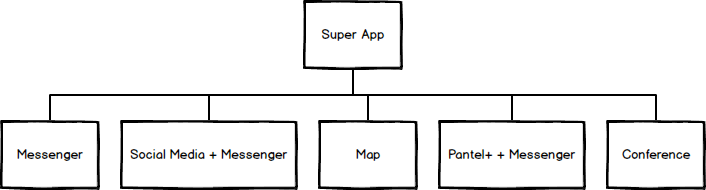
Building the first UX practice at Pantel
Pantel (later Panco): an Iranian "super-app" built around messaging, with social media, maps, and bots/games layered on top. I was the first UX hire → UX Lead of a 2-person team.
The Situation I walked into
• There was no UX practice at Pantel before me — I was the first hire. That meant no user research, no analytics, no product manager, and no business or marketing function to pull target-user or market data from.
• Investors were closely involved in design decisions, and the company needed to move fast, not spend months in discovery.
So the job wasn't just "design the app." It was: figure out what UX even means for this company, earn the trust to act on it, and build something that outlasts me being the only person doing it.
What I did
Setting up the practice, not just the screens
Before touching a single flow, I sat down with the CTO and CEO to explain what UX design actually is, what they could expect from me, and what I needed from them in return. I decided early that I wasn't going to stay a team of one — more services were clearly coming, so I made the case for a UX team and built one after the first design cycle, stepping into the lead role for it.
With no product manager and no formal research budget, I worked guerrilla-style: documenting everything, setting my own timelines, and — since investors were hands-on — leaning on data and user research to justify design decisions rather than asking for trust on faith.
The design work happened in two phases
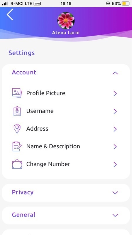
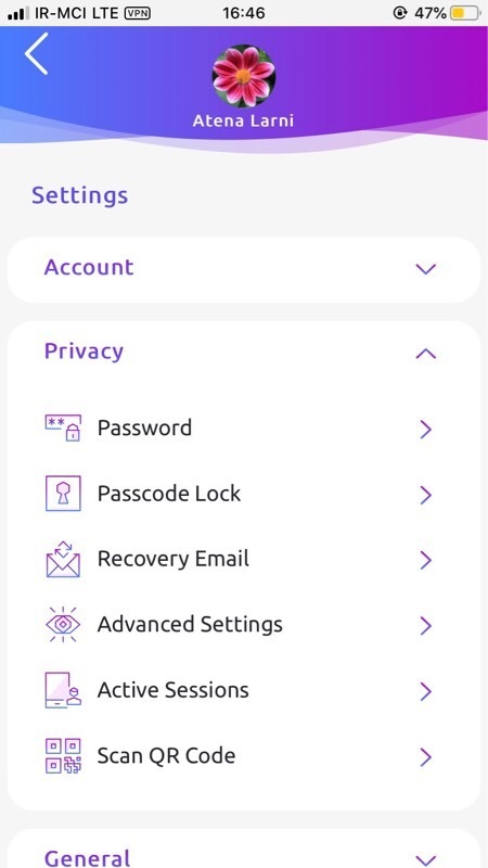
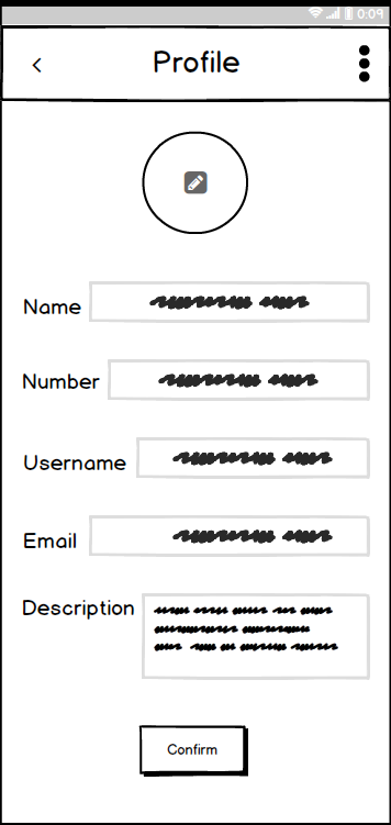
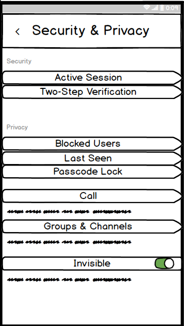
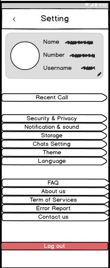
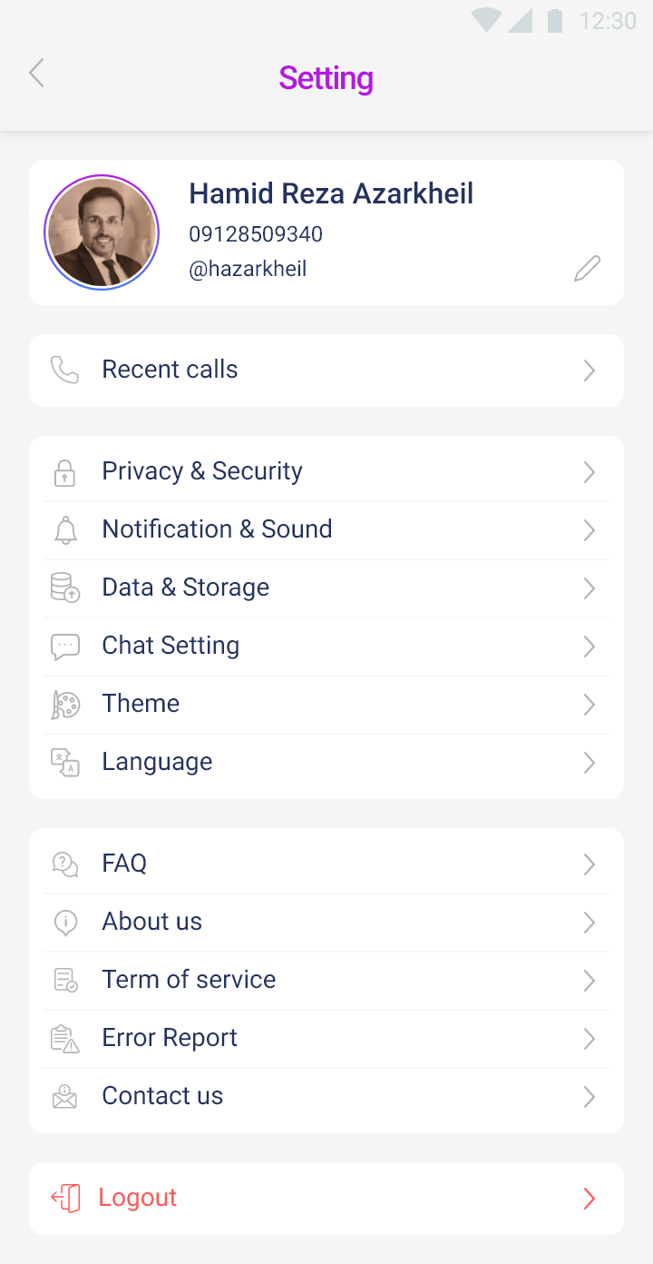
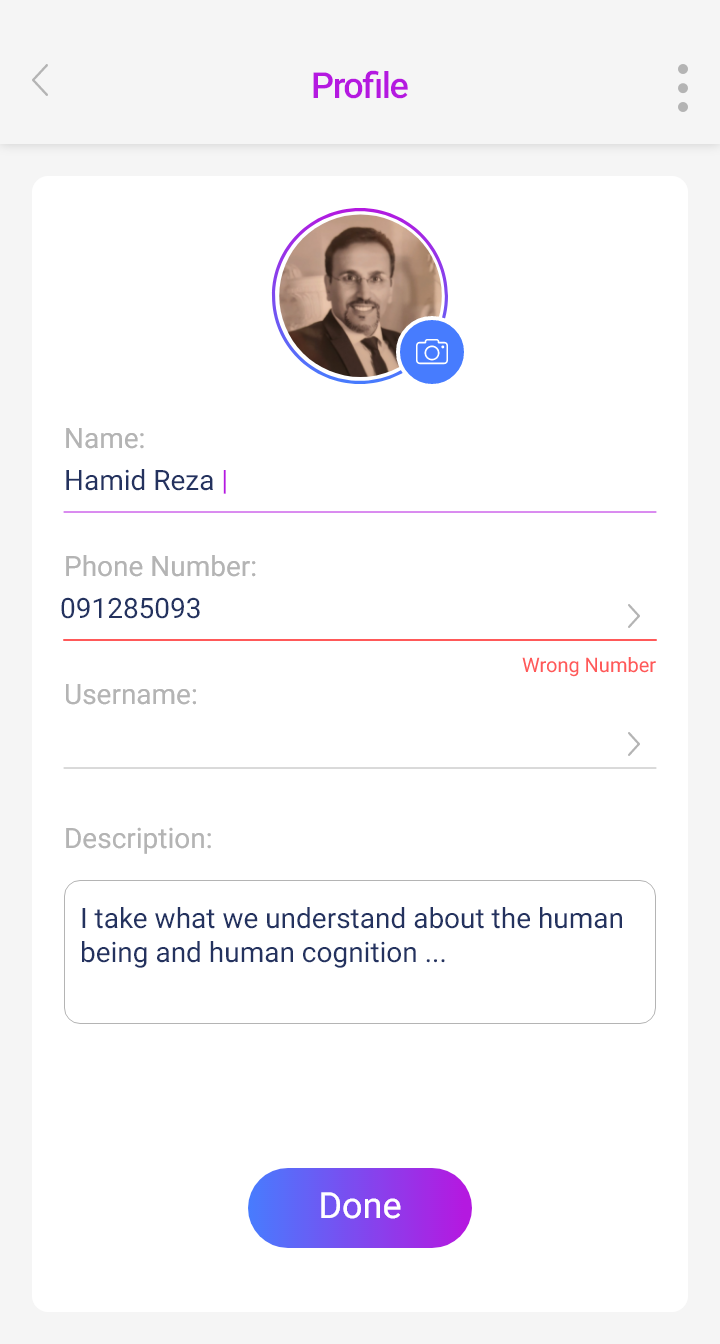
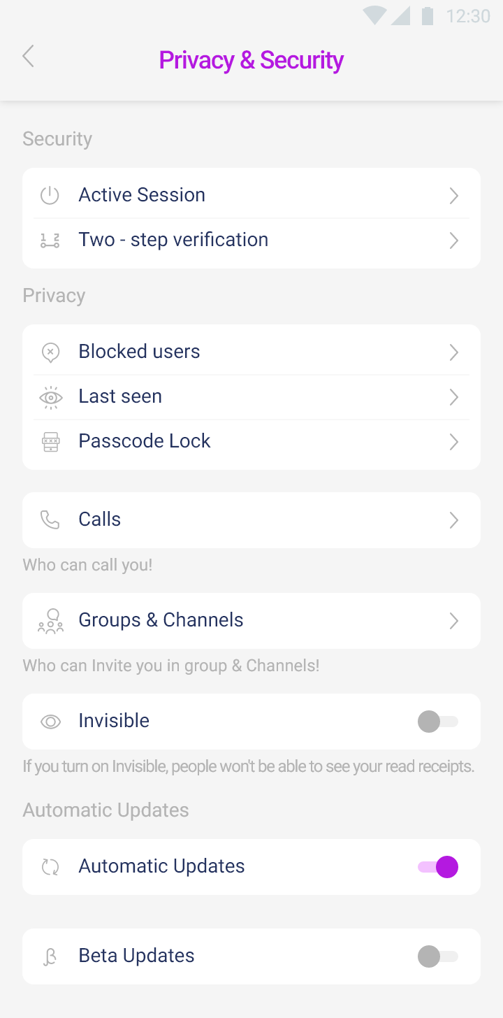
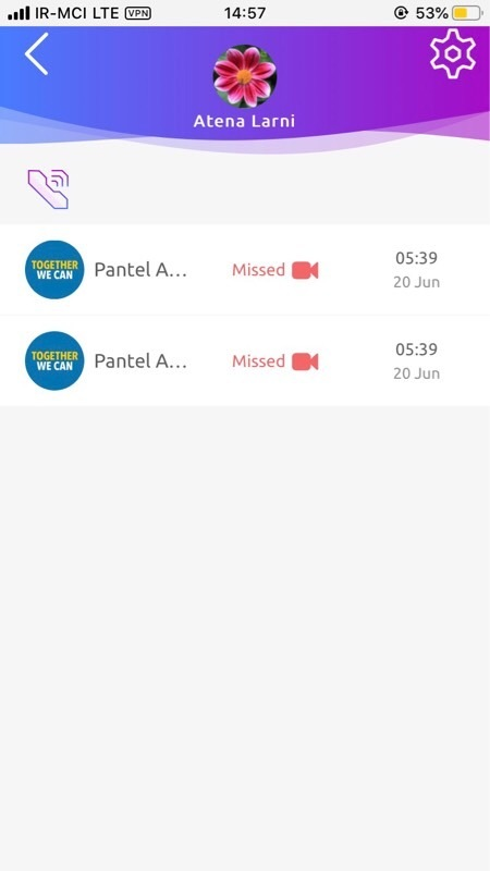
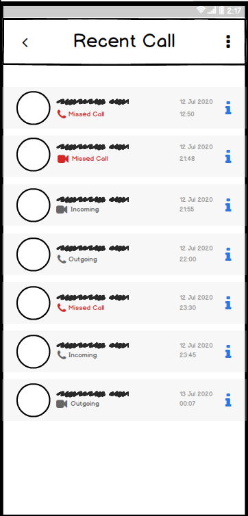
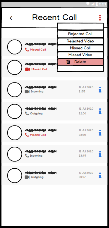
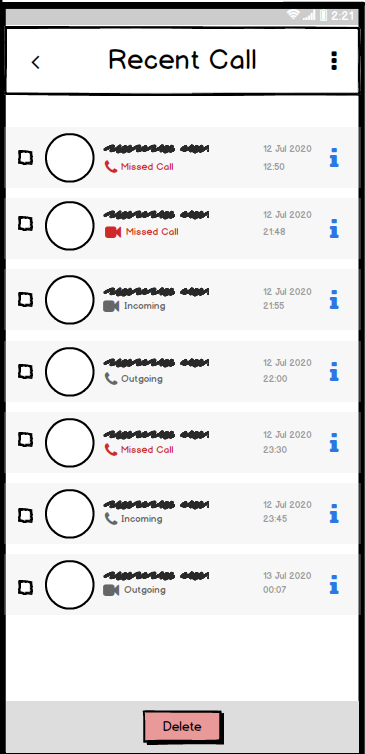
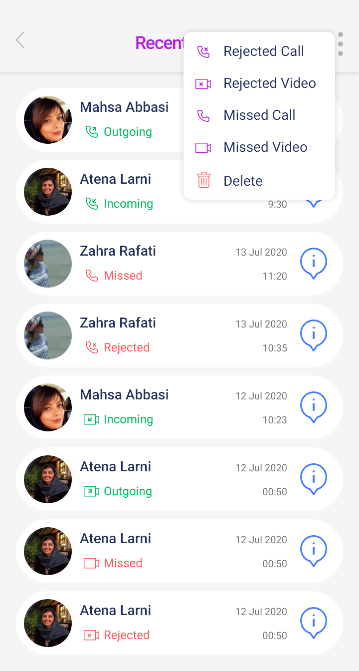
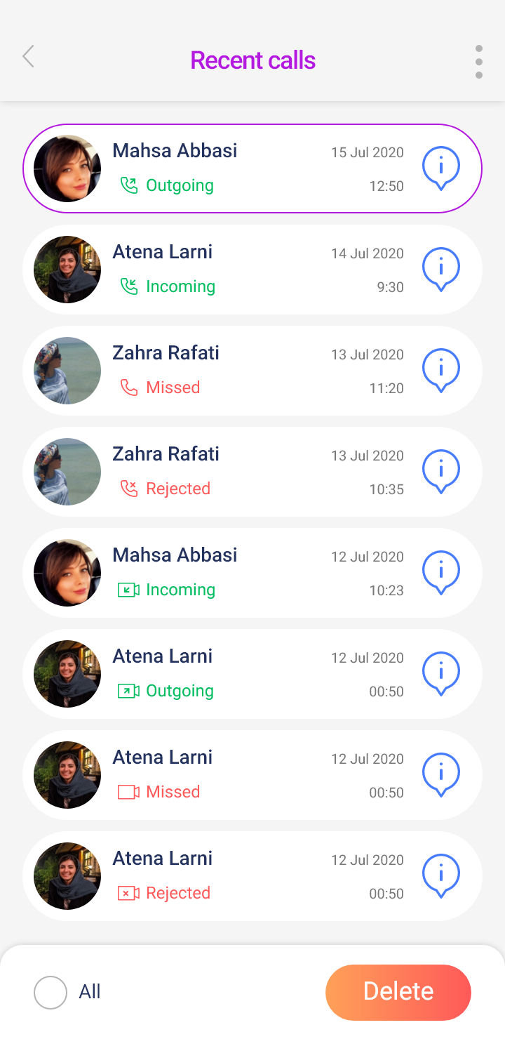
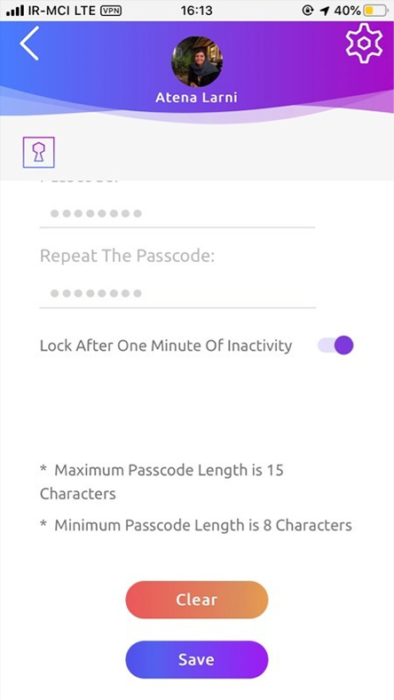
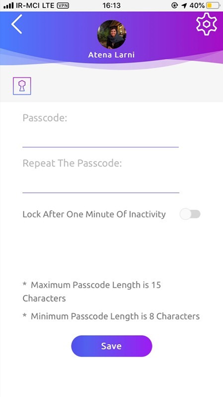
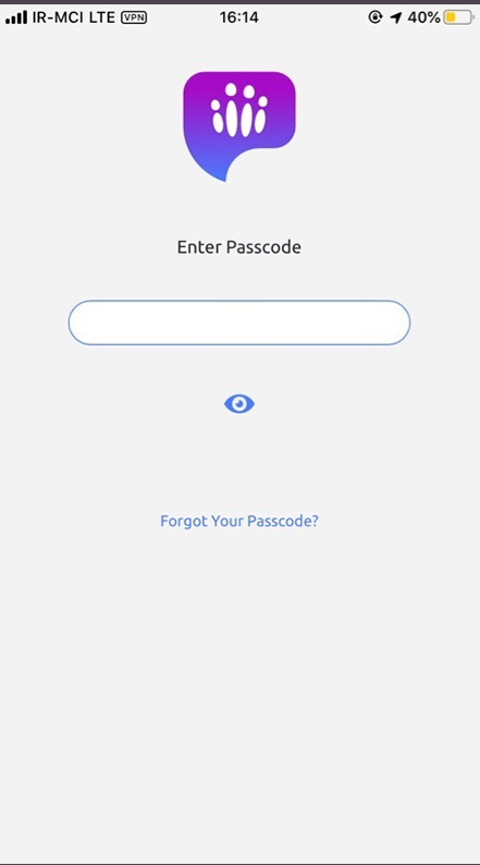
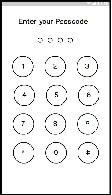
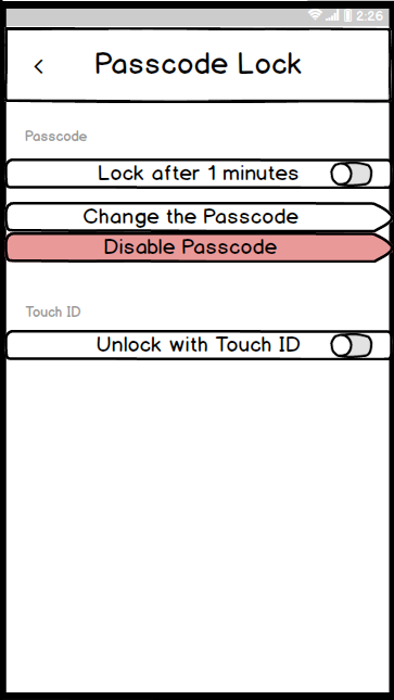
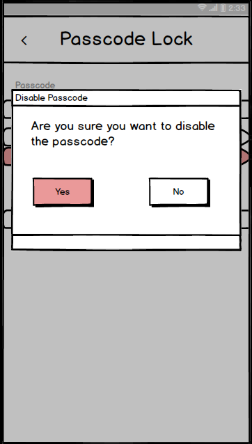
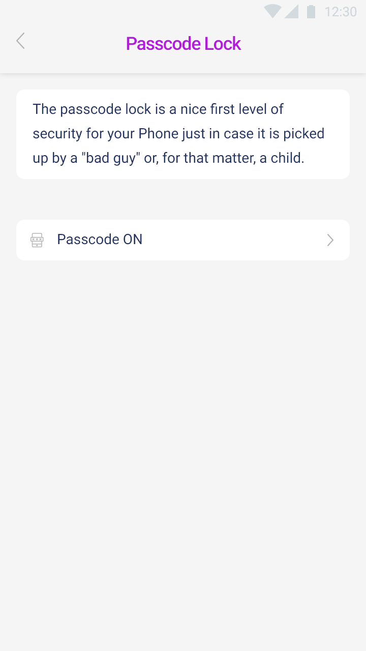
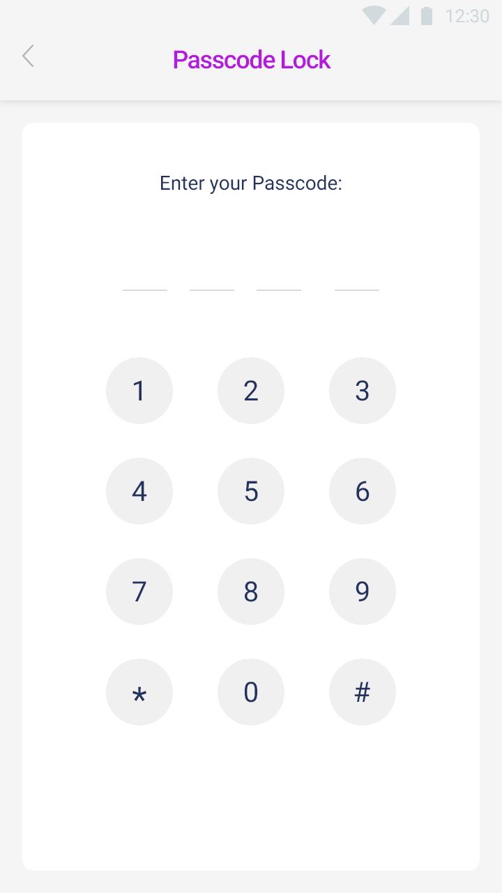
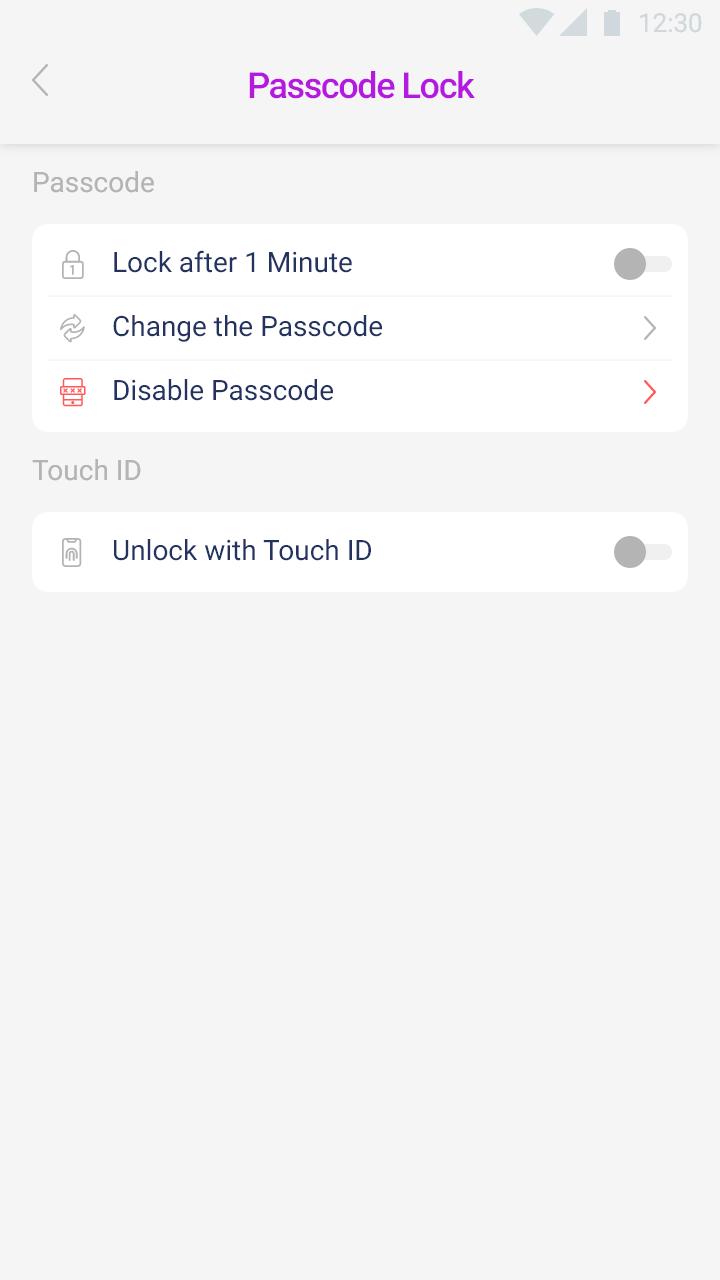
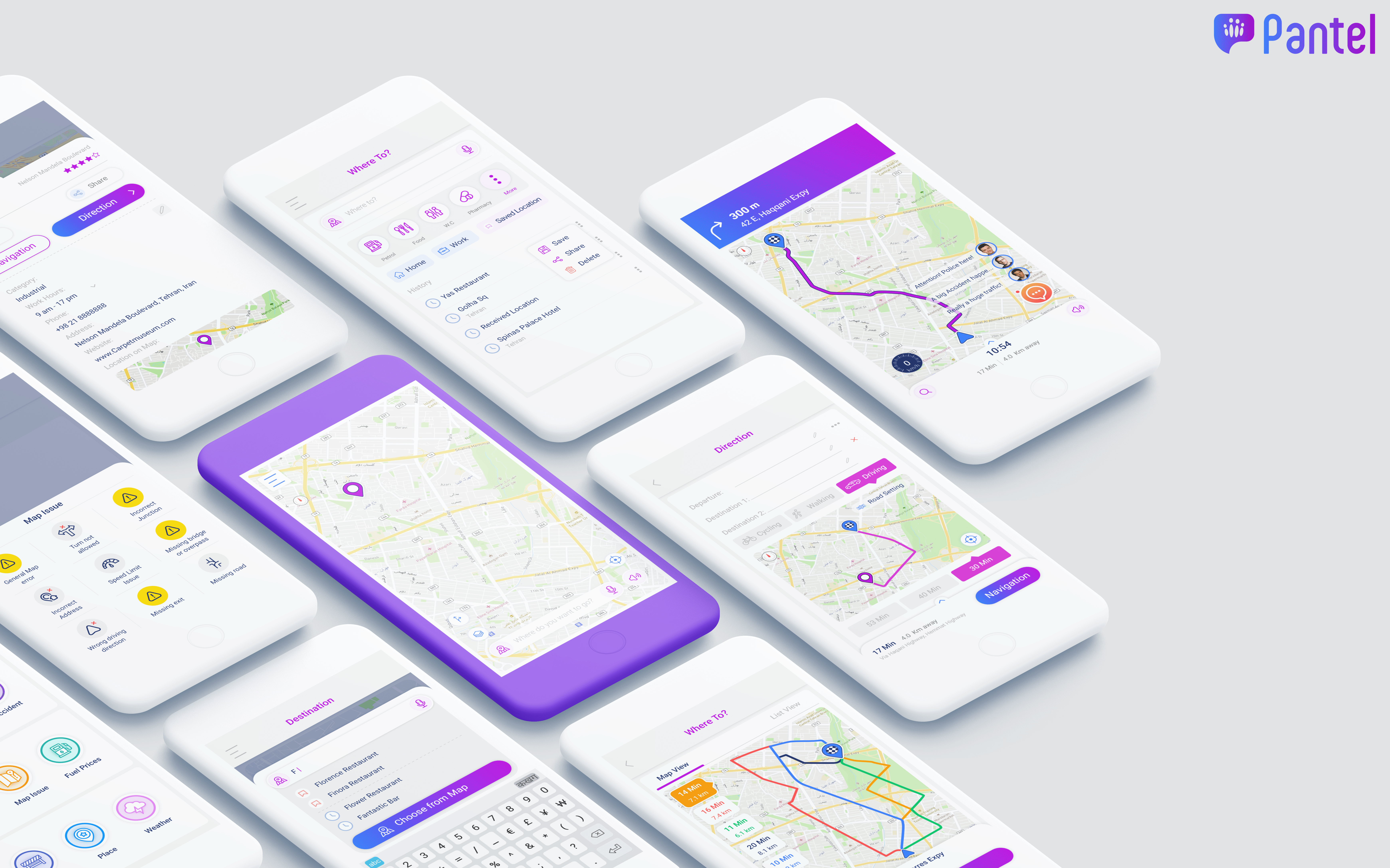
• Phase 1 — Fix what's obviously broken. A first audit showed most of the app's problems were basic usability and IA issues, not things that needed deep research to diagnose (settings, profile, call history, account security). I ran card sorting to reorganize the settings IA, benchmarked against WhatsApp, Telegram, and regional competitors, then moved through wireframes and prototypes to get fixes into the pipeline fast.
• Phase 2 — Understand who's actually using this and why. Once the obvious issues were cleared, I ran a proper research round: a survey (260 respondents out of ~2,000 active users) and 12 phone interviews, built into personas, an empathy map, and journey maps.
The research surfaced something bigger than any single screen fix:
• Users found the app genuinely hard to learn,
• A lot of adoption was driven by short-lived contests, raffles, and prizes rather than the app's actual capabilities,
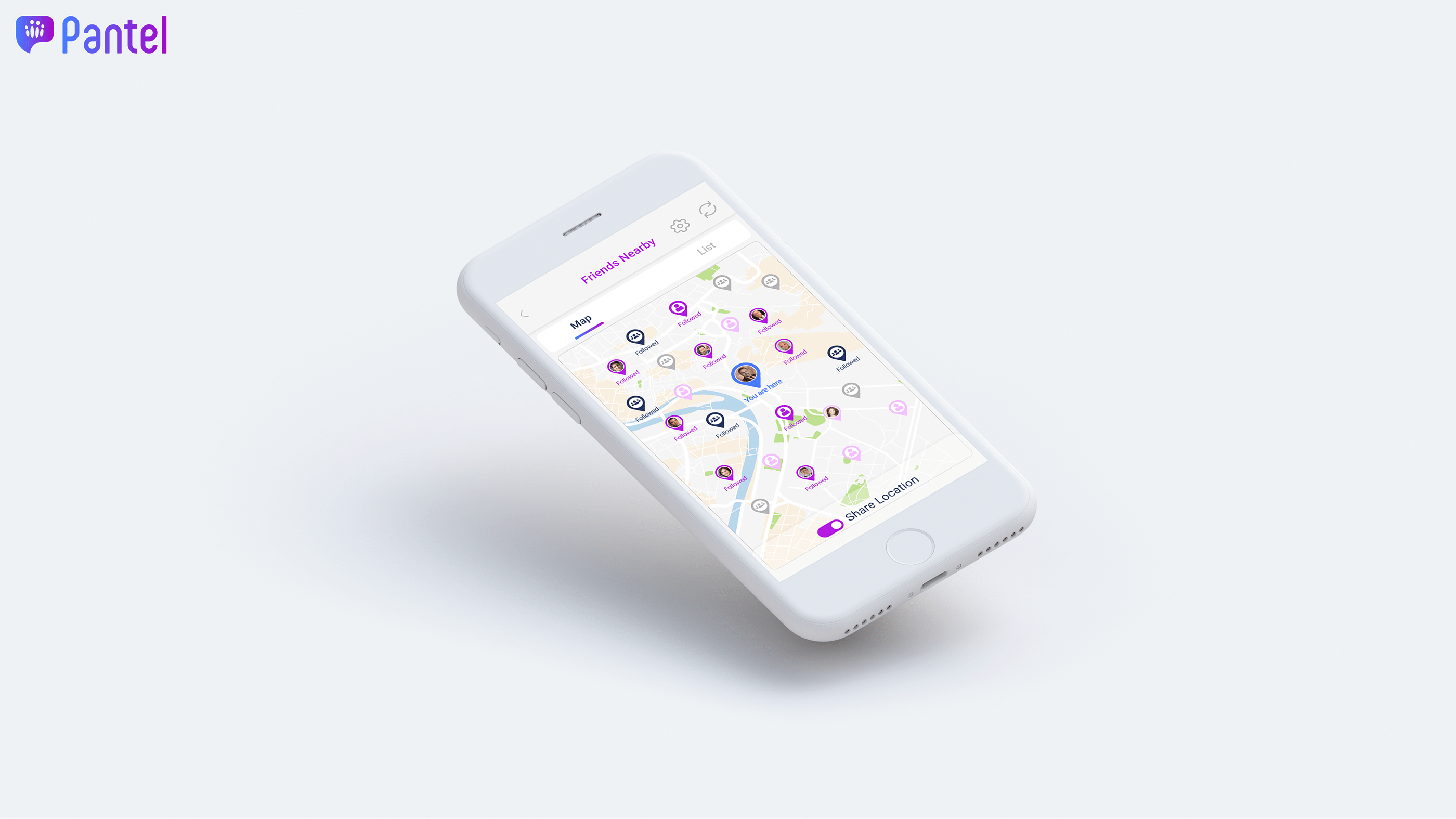
• Weak network effects (few friends already on the platform) meant people had little reason to stay.
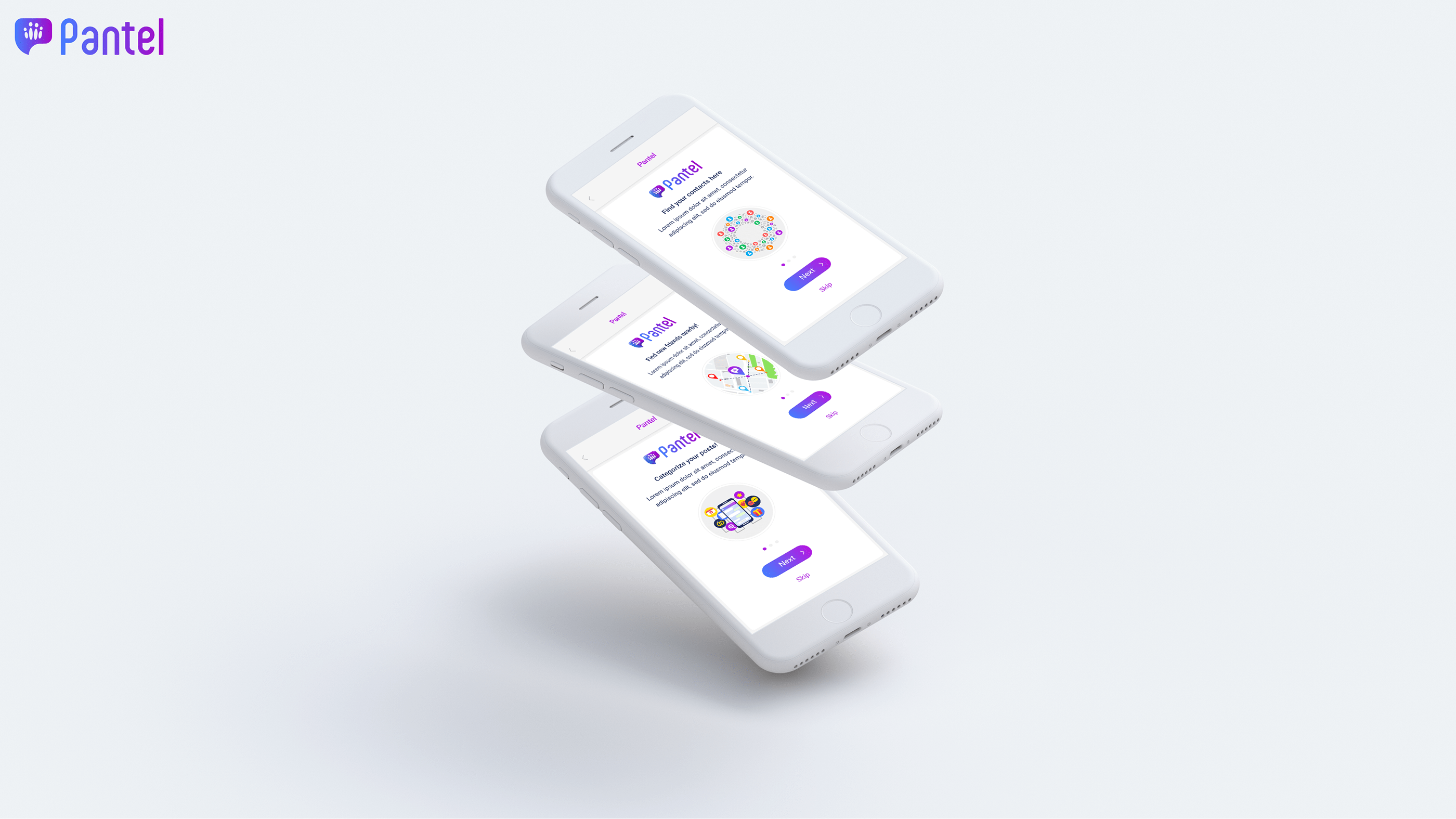
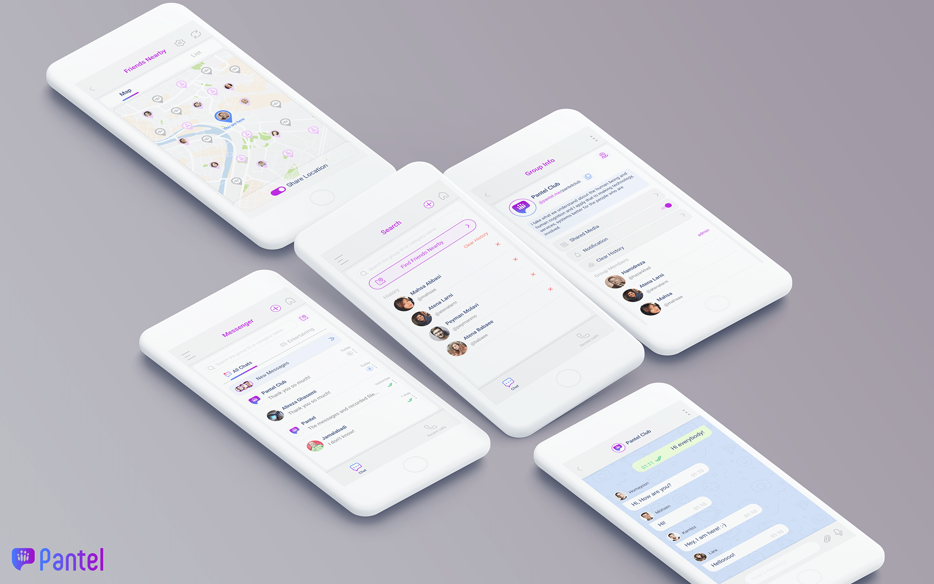
That reframed the whole product conversation — the answer wasn't more features, it was repositioning Pantel as a clear "super-app" with cleanly separated services, rebuilding the home page as a proper service hub, and designing onboarding that actually explained what Pantel was for.
What came out of it
• Pantel's first UX function and practice — built from nothing into a team, in six months
• A shift in product strategy, backed by evidence, from "keep adding services" to "fix and reposition what exists" — with investor buy-in
• A research-backed unbundling of messenger, social, and map services, including a redesigned home page and onboarding flow
I relocated to Finland before the new versions fully shipped, so I don't have final KPI numbers to point to here — this is a case study in setting direction and building a practice from scratch, not in closing the loop on results.
Looking back
This role taught me that in an early-stage company, the hardest UX problem usually isn't the interface — it's building the case, the process, and the trust for change to happen at all. If I were doing it again, I'd push for lightweight analytics much earlier; a lot of the first months went into research that basic tooling would have shortened considerably.