Translating Engineering Constraints into Trustworthy Communication at F-Secure Sense
Company: F-Secure Corporation, Network Security business unit
Role: UX and Service Designer
Duration: August 2022 - September 2023
Within F-Secure's Sense app — a security product built into home routers and gateways — my responsibility was the design of the app end to end, across a continuous stream of features, fixes, and refinements.
Challenge
The two pieces below are representative examples, not the full scope of that work — but they share the same underlying challenge that ran through most of it:
a technical system with real constraints (backend provisioning, SDK detection, connection states) needed to be translated into something a non-technical user could understand and act on, without hiding the complexity that mattered or exposing the complexity that didn't.
Example: Fixing an activation flow that left users stuck
Activating the Sense app and pairing it with the security router is the first thing a new user does — and it was failing people badly.
The flow lacked proper error handling: when something went wrong, users could get stuck indefinitely with no path forward. For some, this meant never actually getting into the app at all.
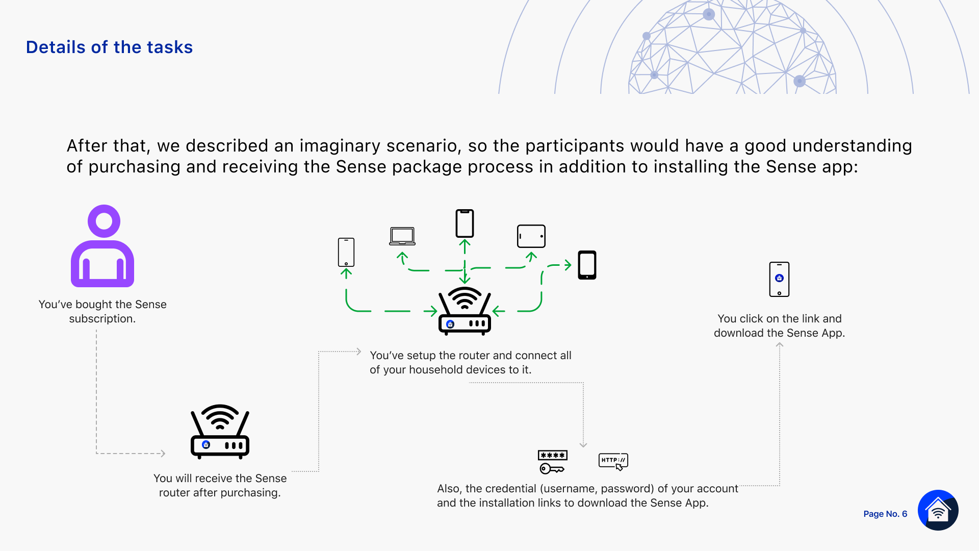
Understanding why required going to the source. I ran a series of sessions with the software architect, backend team, and mobile team to understand the technical reality of the flow: a subscription gets created when a user purchases broadband with security included, the service provider provisions that subscription to F-Secure via API, and F-Secure's backend returns a router activation key.
Two activation models exist:
• Router First: protection is live as soon as the router is plugged in
• App First:the user installs and activates the app to enable service
either way, seamless install and activation was a core business goal.
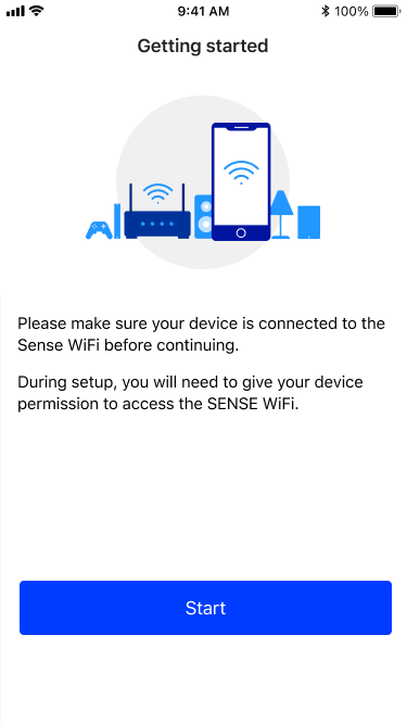
From those conversations, I identified the real source of the errors. users needed to do two things before starting activation:
• set up the security router
• connect their device to that specific router's network, not any other WiFi or cellular connection
and the initial flow never told them that.
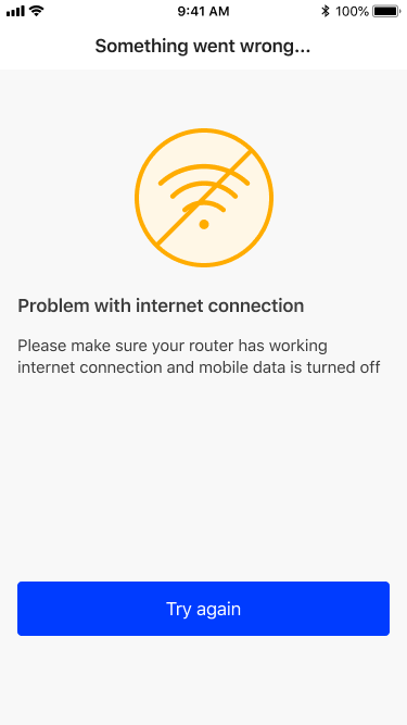
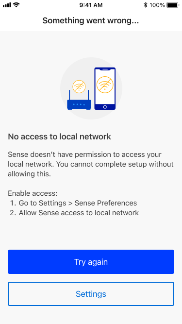
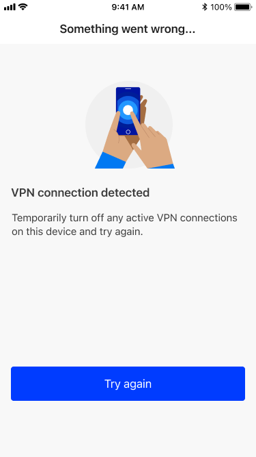
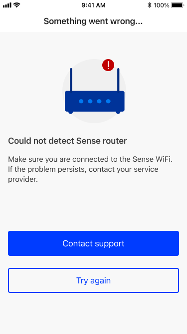
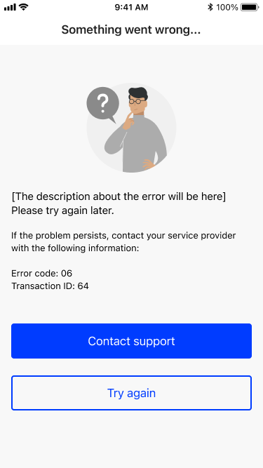
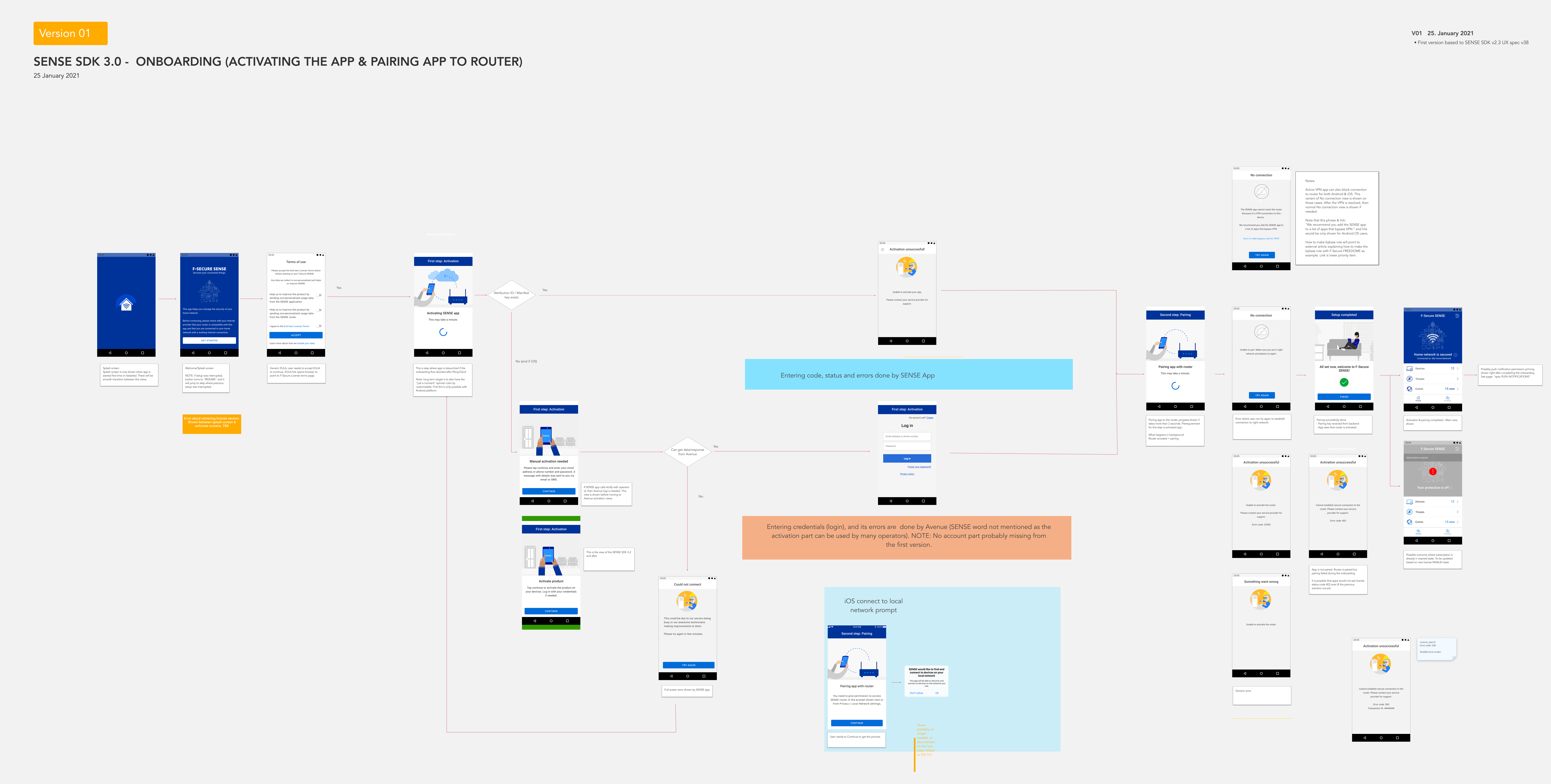
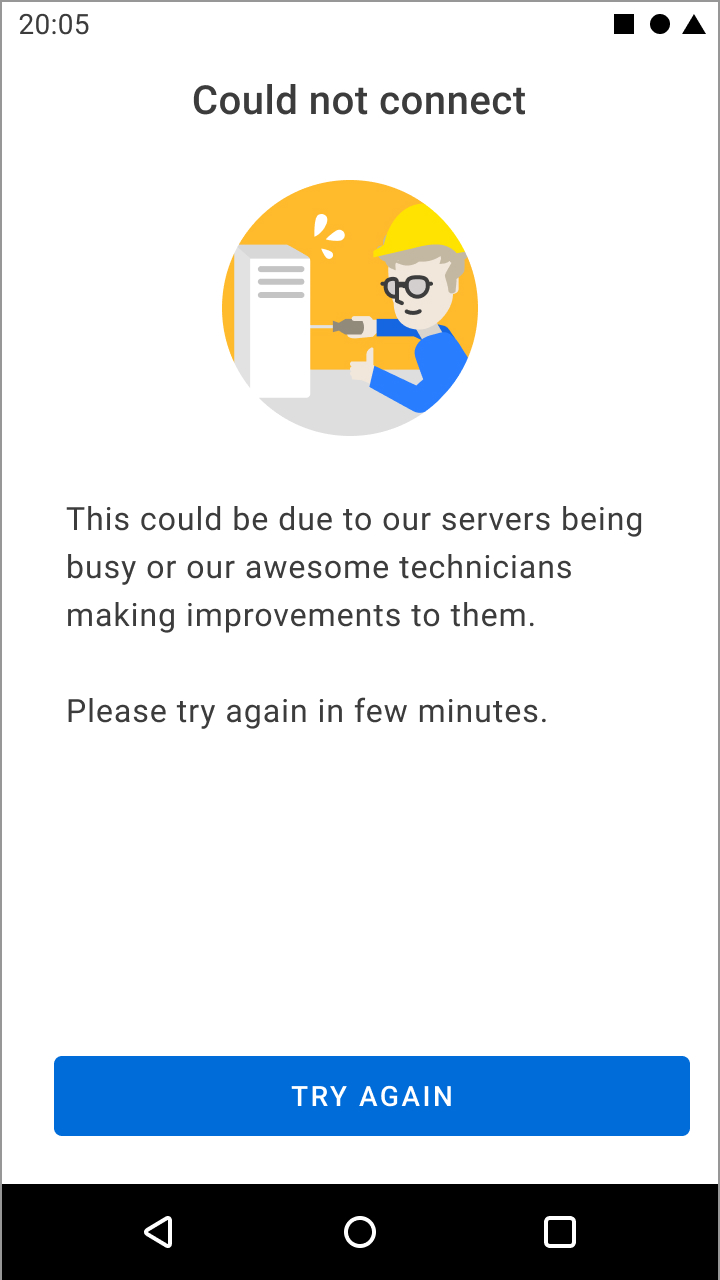
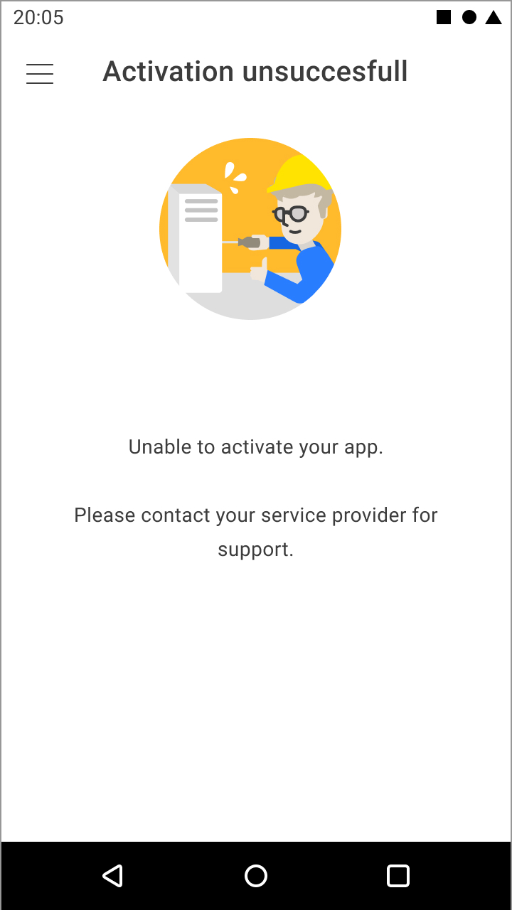
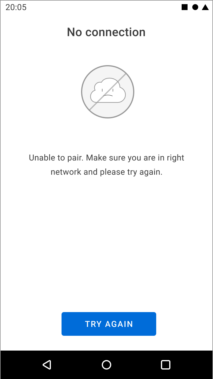
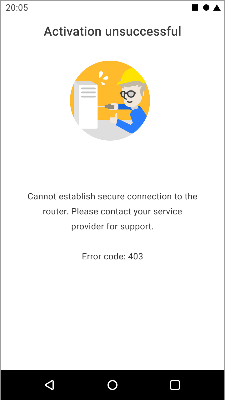
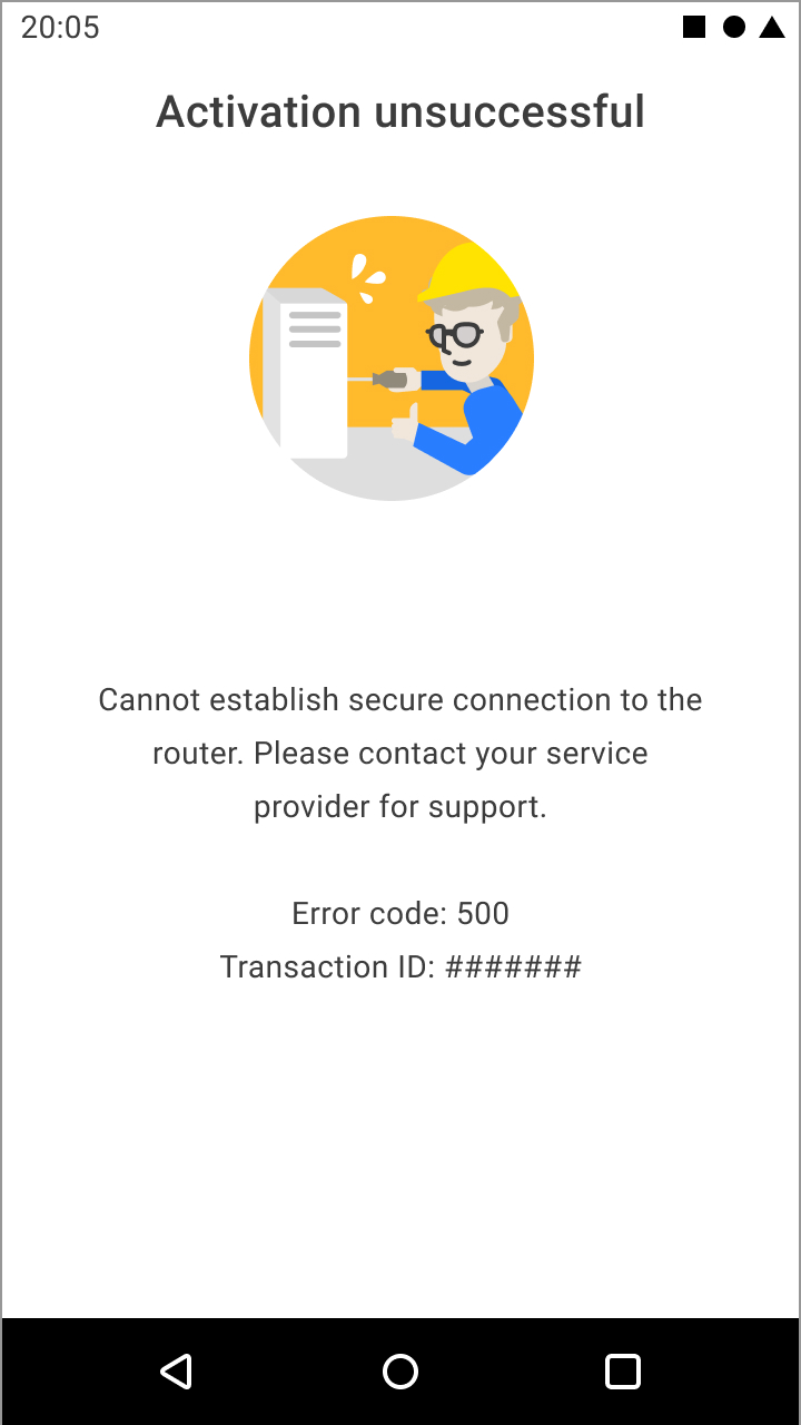
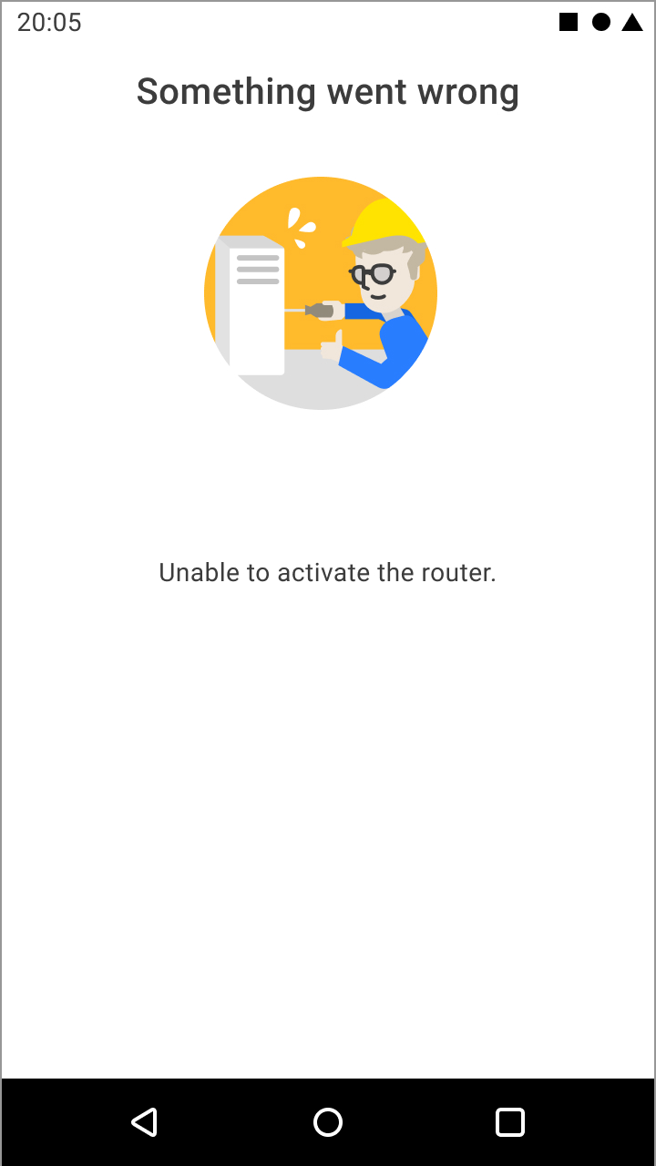
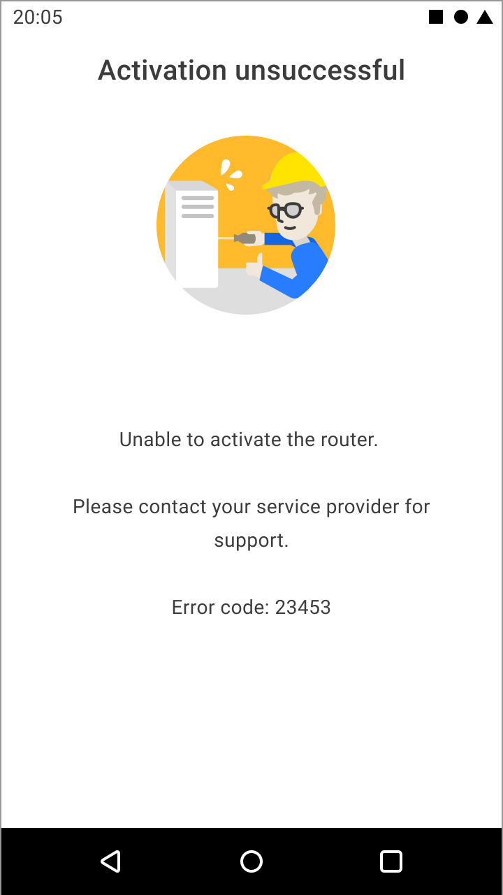
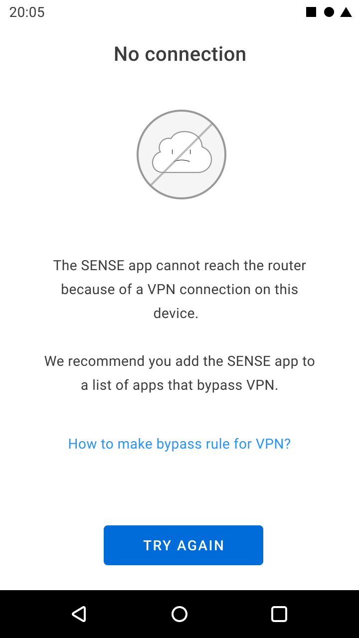
Error messages in Activation flow
==
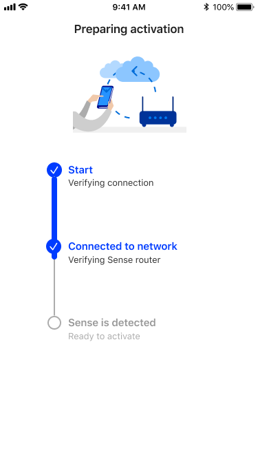
The fix split activation preparation into two clear, visible steps: verifying the device's internet connection, then verifying it was on the correct Sense router network. I deliberately extended the progress bar beyond the 1–2 seconds the technical check actually takes, because the extra time bought three things users needed:
• Visible progress,
• Transparency about what was being checked,
• A precise stopping point if something failed, paired with an error view that told the user how to fix it.
That covered the specific failure modes that had been causing users to get stuck:
• No internet connection (with a direct link to network settings on Android, though that path isn't available on iOS),
• An active VPN interfering with detecting the router's security SDK,
• Being connected to the wrong network or hitting a genuinely faulty router (routed to support after repeated failures)
• On iOS, local network permission not yet granted.
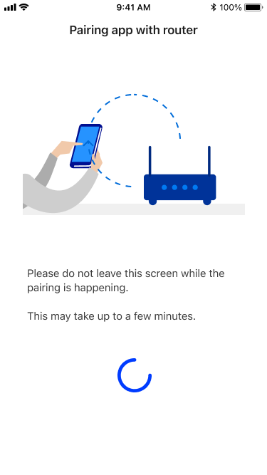
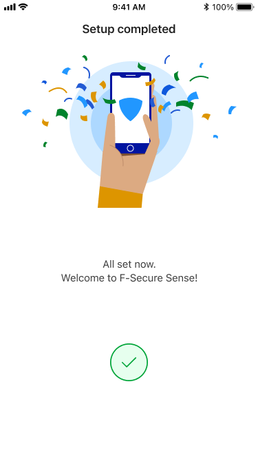
New Activation Flow
Error Messages in Activation Flow
The result was a flow that hand-held users step by step — showing them what was happening at each stage, and, when something did go wrong, exactly how to recover — rather than one that simply left them stranded with no way in.
Example: Getting a status-communication fix adopted against engineering resistance
The device list's status icons had a similar translation problem, but this one took longer to resolve — and resolving it meant convincing a technical team, not just designing a fix.
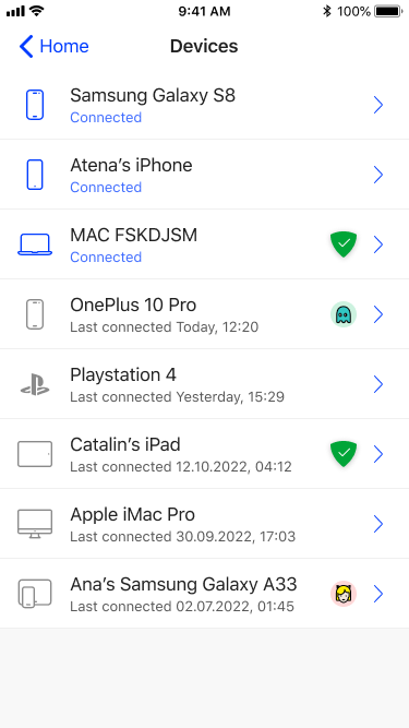
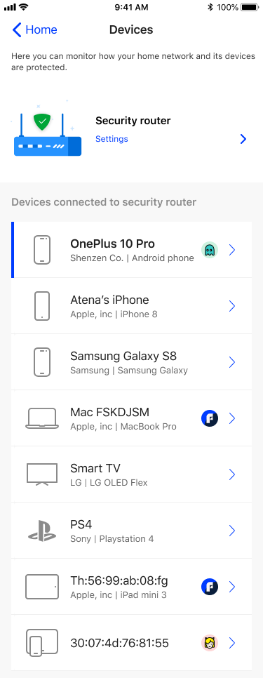
The original design showed both a device's connection status and its protection status using the same visual language — icon color plus a secondary status icon — and it was inconsistent and confusing.
My recommendation was to stop treating connection status as meaningful information for users at all, and let the icon communicate protection status only.
Engineering pushed back on making the change, and I didn't have access to run formal user research to make the case more forcefully.
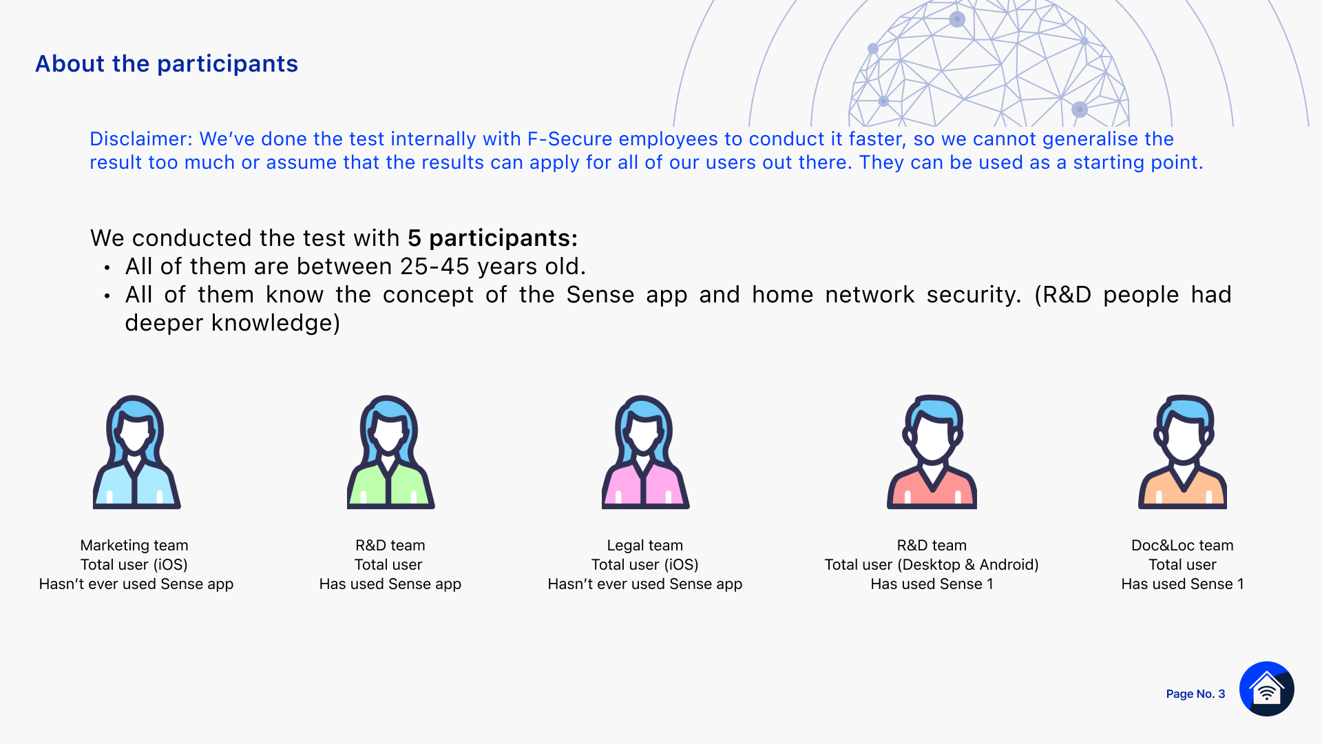
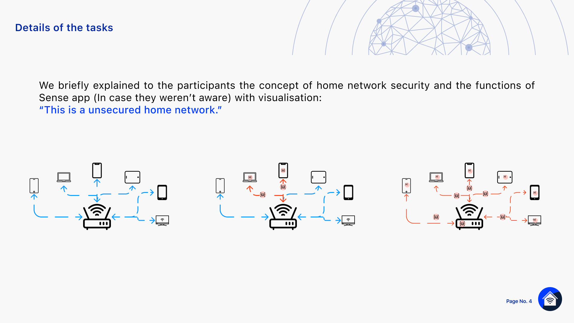
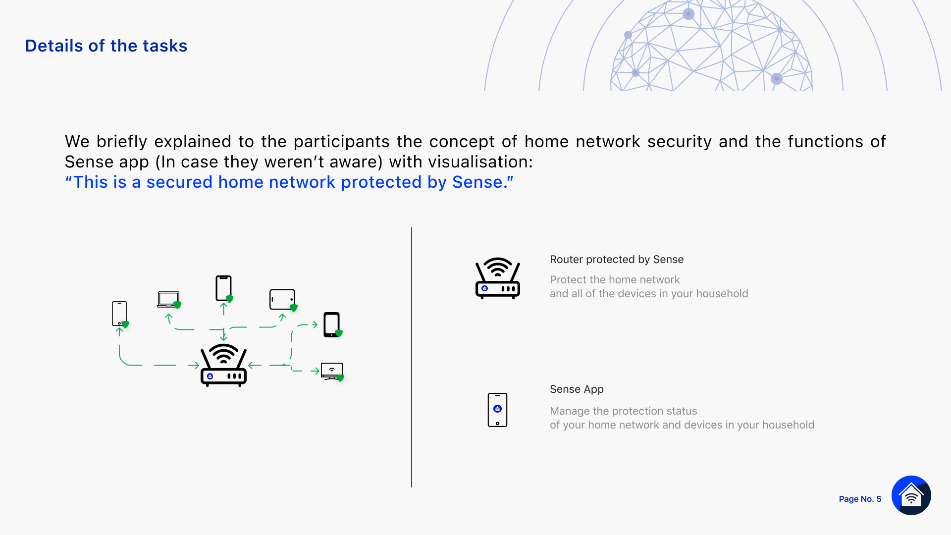
What I could do was run the closest available substitute: an internal usability test with five participants across different functions, testing the redesigned device list directly.
It came with an explicit caveat — internal participants aren't a stand-in for real customers, and the results couldn't be generalized — but it was a legitimate starting point.
The test confirmed the underlying issue hadn't actually gone away: users still couldn't tell what a device icon's color was supposed to mean.
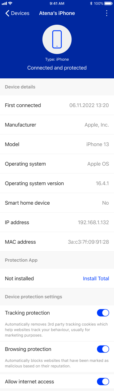
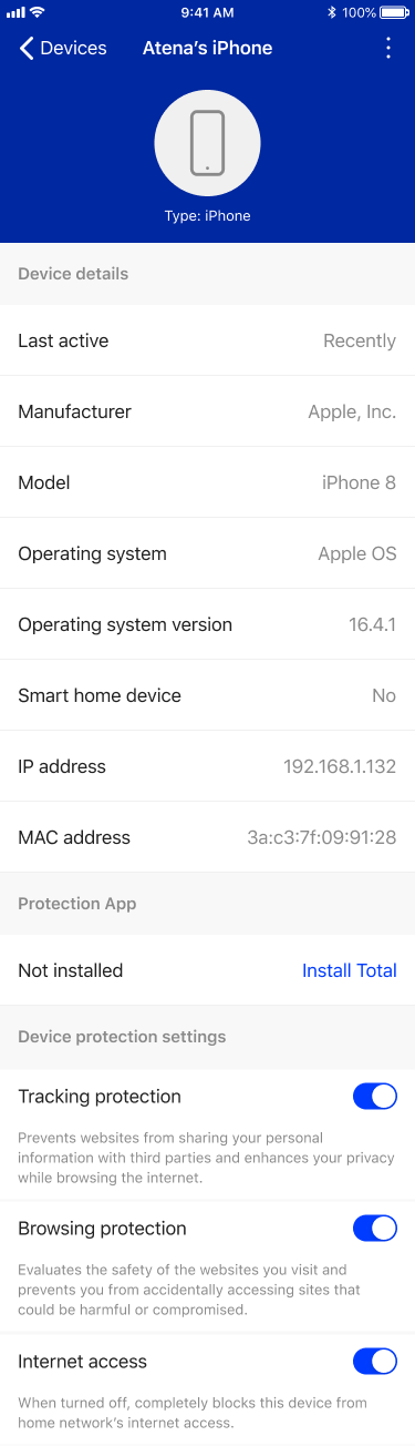
That evidence became the basis for a further-refined design: connection status dropped out of the device list entirely, and the icon now reflects protection status alone — normal, needs attention, or urgent, each with a clear, specific message and action ("Turn protection on," "Allow internet access") in the device's detail view.
This time, the recommendation was adopted — not because the underlying argument had changed, but because it was now backed by evidence that aligned with what I'd been recommending from the start.
Old Design of Device list and Device details view
New Design of Device list and Device details view
Why it matters
Both of these are, at heart, the same kind of work: taking a system that's genuinely complex underneath and deciding, carefully, what a user actually needs to know at the moment they need to know it — no more, no less.
The harder lesson from the second workstream is that getting a good recommendation adopted inside an engineering-led team sometimes takes more than being right; it takes finding whatever evidence is actually available, even informal or unofficial, and using it to make the case land.
That's a pattern I still navigate with clients: a design or strategy recommendation can be correct and still fail to land inside a team, especially a technical one, until it's backed by something the team can see and check for itself.
Part of operationalizing customer insight is knowing how to build that evidence even when the ideal version of it — formal research, full user access — isn't available.
 ==
==